Skip to content
Bootstrap tutorial – A step by step Bootstrap guide
In This Tutorial
Twitter Bootstrap – An introduction
The twitter Bootstrap is one of the most popular front-end web development framework that was created at a company, Twitter Inc, by @mdo and @fat in the mid-2010. The Bootstrap framework is for web designers and developers, that makes the website development process quite easier, reduces development time and it is powerful.
A Video Introduction to Bootstrap
The Bootstrap framework is for all skill levels – beginners with a basic knowledge of HTML and CSS, designers (who are more expert in designing the websites and less in development) and web developers, who are expert in the server side scripting.
The Bootstrap framework is mobile first, responsive i.e. it adapts the “shape” of the device where your website visitor is visiting the website. As such you should expect visitors from any operating system and different devices – from different resolutions of desktop screens to tablets to different sizes smartphones or mobile phones. The Bootstrap makes your website adjust according to the user’s screen so that your visitors won’t see early days ugly scroll bars in the mobile/smart phones and run away immediately. Or otherwise, you had to write different codes for different devices in order to make it more readable, with different navigation etc. Bootstrap enables you to write you just one code that is scaled to any device or screen size.
The Bootstrap framework is the mobile first is really an important point. Historically, just a few years back, the first thing in the minds of developers and designers were desktop or big screen version of the websites. Though, the mobile end was also in mind but it was a secondary phase, generally. However due to the fact of fast grown and still growing mobile industry with over 1.2 Billion mobile web users worldwide and growing, where around 25% of web users are mobile only in the US and over 10 billion times mobile applications are downloaded; mobile first makes Bootstrap framework even more attractive. This feature is included in the Version 3 of Bootstrap as part of the default CSS. The earlier version had to use another CSS part to achieve responsiveness.
Bootstrap is an open source project. This is now hosted in GitHub that can be located here: https://github.com/twbs/bootstrap.
History of the Twitter Bootstrap
The Bootstrap was basically served as the Twitter Blueprint. It was created by a Twitter’s designer and a developer in the mid-2010 before it became an open source framework. Within the company (Twitter), Bootstrap served as the styles guide for internal tools development and still doing so.
Twitter Bootstrap has two major rewrites, V2, and V3 while it had over twenty releases, since the original release, back in Aug 2011.
As this project was developed by the company, Twitter, generally Bootstrap started referred to as Twitter Bootstrap. While the company states this should simply be referred to as Bootstrap with “B” as capital.
What Bootstrap Provides
Bootstrap framework uses HTML 5 and CSS along with the JavaScript/jQuery. Bootstrap comes up with the 12-grid system to work with the responsive layouts. It provides commonly used components in the websites like Buttons, Forms, Tables, Dropdowns, Alerts, Carousel, Navigation, Responsive images, Typography, Glyph-icons, etc. It also provides JavaScript components/plugins like Modals, Dropdowns, ScrollSpy, Tooltips, Popovers, Alert Messages, Buttons, Collapse etc.
You will find using these CSS features or JavaScript components with examples in this tutorial.
What this Bootstrap tutorial will cover
This tutorial will cover Bootstrap features and how to design themes with Bootstrap along with components in V3. The features like Bootstrap CSS, tables, dropdowns, bootstrap forms, buttons, tooltips, icons etc. chapters can be found on the left navigation of this website. Also, important JavaScript plugins like Modals, ScrollSpy, Popovers, Alert Messages etc. are covered in this tutorial with examples. Go to left navigation to find complete lesson of any topic.
A basic Bootstrap landing page example
Before you go to the next chapters, here is a basic Bootstrap based theme where you can see how easy it is to create a website using Bootstrap framework. It will show commonly used components found in different websites. You can also experience proceedings online by clicking at “Experience it online” or can copy paste to your local system to see it at your local machine.
Target to achieve
The target is to create a website landing page with a navigation (menu) on the top followed by a carousel. After that, we will create four “columns”. Two columns with information, one with a sign-up form and the right most with another navigation to other web pages. Finally, we will place a footer with the copyright info.
The final landing page will look as this (click the link):
Experience this online
Let us start creating a quick demo
First of all, download the Bootstrap framework from the official website: http://getbootstrap.com/getting-started/
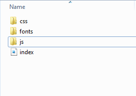
At this stage, I will recommend downloading Simple Bootstrap for this demo which is a compiled and minified CSS, JavaScript, and Font. This is the minimum requirement for your website in the Live mode as well. Download and unzip it. The file structure including our index.html demo file (explained in the next section) should look like this:
Open your text editor and create an index.html file.
The first line of code will be <doctype> declaration. As Bootstrap is based at HTML 5, we will declare it by using HTML 5 declaration as follows:
|
1
|
<!DOCTYPE html>
|
Include Bootstrap library
In order to use Bootstrap framework’s CSS, its components or JavaScript you have to include some files in your web pages as follows:
Including CSS in the <head> section:
<link rel=”stylesheet” type=”text/css” href=”css/bootstrap.min.css”>
Including jQuery and bootstrap.js in the <body> section just before </body> closing tag as follows:
<script src=”http://code.jquery.com/jquery-1.10.1.min.js”></script>
<script src=”js/bootstrap.min.js”></script>
The code until now will look like this, including the title:
Experience this online
|
1
2
3
4
5
6
7
8
9
10
11
12
13
14
15
16
17
18
19
20
21
22
23
24
25
|
<!DOCTYPE html>
<html>
<head>
<meta charset=“utf-8”>
<title>Basic Bootstrap Template</title>
<link rel=“stylesheet” type=“text/css” href=“css/bootstrap.min.css”>
<meta name=“viewport” content=“width=device-width, initial-scale=1.0”>
</head>
<body>
<script src=“http://code.jquery.com/jquery-1.10.1.min.js”></script>
<script src=“js/bootstrap.min.js”></script>
</body>
</html>
|
The next step is to create a container, which is a main div that will contain the whole web page. We will use container CSS class in the main div element. Next is an <h3> heading that will appear on the top followed by the menu bar or navigation bar. First, have a look at the code and output then I will explain what we have done!
Just paste this code after opening <body> tag, if you are doing this in your local system:
Experience this online
|
1
2
3
4
5
6
7
8
9
10
11
12
13
14
15
16
17
18
19
20
21
22
23
24
25
26
27
28
29
30
31
32
33
34
35
36
37
38
39
40
41
42
43
44
45
46
47
48
49
50
51
52
53
54
55
56
57
58
59
60
61
62
63
64
65
66
67
68
69
70
71
|
<!–Main container div starts here –>
<div>
<h1>A Basic Bootstrap website</h1>
<nav role=“navigation”>
<div class=“container-fluid”>
<!– Navigation bar –>
<div id=“bs-example-navbar-collapse-1”>
<ul class=“nav navbar-nav”>
<li class=“active”><a href=“#”>Home</a></li>
<li class=“dropdown”>
<a href=“#” data-toggle=“dropdown”>Products <b></b></a>
<ul class=“dropdown-menu”>
<li><a href=“#”>Product 1</a></li>
<li><a href=“#”>Product 2</a></li>
<li><a href=“#”>Product 3</a></li>
<li class=“divider”></li>
<li><a href=“#”>Product 4</a></li>
<li class=“divider”></li>
<li><a href=“#”>Product 5</a></li>
</ul>
</li>
<li><a href=“#”>Services</a></li>
<li><a href=“#”>About</a></li>
<li><a href=“#”>Contact</a></li>
</ul>
<form class=“navbar-form navbar-left” role=“search”>
<div class=“form-group”>
<input type=“text” placeholder=“Search site”>
</div>
<button type=“submit”>Go</button>
</form>
</div><!– /.navbar-collapse –>
</div><!– /.container-fluid –>
</nav>
<!– Navigation bar ends here –>
</div>
|
As you can see, the <h3> will show main title of the page that appears above the menu bar. Below that navigation bar is started by:
<nav role=”navigation”>
The <nav> is an HTML 5 tag that is assigned to navbar and navbar-default CSS classes from the framework.
After that, we have a <div> container that contains navigation bar. Our demo navigation contains a few links and a dropdown with “products”. A small form with site search facility is also there by using the Bootstrap’s form.
Create Carousel Section
Next section is creating the carousel with three images sliding. You can see sliding images with proceedings online by clicking “Experience this online” below or copy and paste if you are doing it at your local machine. You have to place the images in the “images” folder at the same location where the “index” file is created.
Experience this online
|
1
2
3
4
5
6
7
8
9
10
11
12
13
14
15
16
17
18
19
20
21
22
23
24
25
26
27
28
29
30
31
32
33
34
35
36
37
38
39
40
41
42
43
44
45
46
47
48
49
50
51
52
53
54
55
56
57
58
59
60
61
62
63
64
65
66
67
68
69
70
71
72
73
74
75
76
77
78
79
80
81
|
<!–carousel section starts here –>
<div id=“carousel-example-generic” class=“carousel slide” data-ride=“carousel”>
<!– Indicators –>
<ol class=“carousel-indicators”>
<li data-target=“#carousel-example-generic” data-slide-to=“0” class=“active”></li>
<li data-target=“#carousel-example-generic” data-slide-to=“1”></li>
<li data-target=“#carousel-example-generic” data-slide-to=“2”></li>
</ol>
<!– Wrapper for slides –>
<div class=“carousel-inner”>
<div class=“item active”>
<img src=“images/CSS-logo.png” alt=“…”>
<div class=“carousel-caption”>
<h1>CSS Tutorial</h1>
<p><button>Go to CSS Tutorial</p>
</div>
</div>
<div class=“item”>
<img src=“images/jquery-logo.png” alt=“…”>
<div class=“carousel-caption”>
<h1>Write less Do More</h1>
<p><button>Go to jQuery tutorial</p>
</div>
</div>
<div class=“item”>
<img src=“images/java-logo.png” alt=“…”>
<div class=“carousel-caption”>
<h1>Java Tutorial</h1>
<p><button>Go to Java Tutorial</p>
</div>
</div>
</div>
<!– Controls –>
<a class=“left carousel-control” href=“#carousel-example-generic” data-slide=“prev”>
<span class=“glyphicon glyphicon-chevron-left”></span>
</a>
<a class=“right carousel-control” href=“#carousel-example-generic” data-slide=“next”>
<span class=“glyphicon glyphicon-chevron-right”></span>
</a>
</div>
<!–carousel section ends here –>
|
Four columns including sign-in form
The next section creates four columns, including two columns with the main “product” or “service” or “feature” info. Next one is the sign-in form, followed by the in page navigation with links.
Experience this online
|
1
2
3
4
5
6
7
8
9
10
11
12
13
14
15
16
17
18
19
20
21
22
23
24
25
26
27
28
29
30
31
32
33
34
35
36
37
38
39
40
41
42
43
44
45
46
47
48
49
50
51
52
53
54
55
56
57
58
59
60
61
62
63
64
65
66
67
68
69
70
71
72
73
74
75
76
77
78
79
80
81
82
83
84
85
86
87
88
89
90
91
92
93
94
95
96
97
98
99
100
101
102
103
104
105
106
107
108
109
110
111
|
<hr />
<!– Example row of columns –>
<div class=“row”>
<div class=“col-lg-3”>
<h2>Example Heading!</h2>
<p class=“text-danger”></p>
<p>Example Text Here for features, product or service etc! Example Text Here for features, product or service etc Example Text Here for features, product or service etc Example Text Here for features, product or service etc Example Text Here for features, product or service etc</p>
<p><a href=“#” role=“button”>More info »</a></p>
</div>
<div class=“col-lg-3”>
<h2>Example Heading</h2>
<p>Example Text Here for features, product or service etc! Example Text Here for features, product or service etc Example Text Here for features, product or service etc Example Text Here for features, product or service etc Example Text Here for features, product or service etc</p>
<p><a href=“#” role=“button”>More info »</a></p>
</div>
<div class=“col-lg-4”>
<h2>Existing Users</h2>
<form role=“form”>
<div>
<label for=“inputEmail3”>Email</label>
<div>
<input type=“email” id=“inputEmail3” placeholder=“Email”>
</div>
</div>
<div>
<label for=“inputPassword3”>Password</label>
<div>
<input type=“password” id=“inputPassword3” placeholder=“Password”>
</div>
</div>
<div>
<div>
<div>
<label>
<input type=“checkbox”> Remember me
</label>
</div>
</div>
</div>
<div class=“form-group”>
<div>
<button type=“submit”>Sign in</button>
</div>
</div>
</form>
</div>
<div class=“col-lg-2”>
<ul class=“nav nav-sidebar”>
<li class=“active”><a href=“#”>Overview</a></li>
<li><a href=“”>Nav item</a></li>
<li><a href=“”>Nav item again</a></li>
<li><a href=“”>One more nav</a></li>
<li><a href=“”>Another nav item</a></li>
<li><a href=“”>More navigation</a></li>
</ul>
</div>
</div>
|
To properly differentiate the section, we have added <hr/> tag to add horizontal lines.
And finally another <hr/> followed by the footer section, by using the “footer” class in the div element.
Experience this online
|
1
2
3
4
5
6
7
8
9
|
<hr />
<!– Site footer –>
<div class=“footer”>
<p>© Company 2014</p>
</div>
|
What’s Next
The introductory chapter only explains, what is Twitter Bootstrap framework and a straight forward example of creating a bootstrap based landing page.
The next step is to learn, what are CSS features and JavaScript components provided by Bootstrap. You may find chapters at the left navigation about bootstrap CSS, bootstrap table, forms, bootstrap modal, carousel and other useful features.
Leave A Comment?